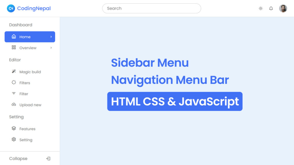
If you’re unfamiliar, a sidebar is a section positioned along one side of a website, typically containing navigation links or widgets. The sidebar is used to provide convenient access to different pages and enhance the overall user’s navigation.
In this blog post, you will learn how to create a responsive side navigation bar with submenus using HTML, CSS, and JavaScript. This sidebar includes many features like submenus, a dark or light theme mode, and other things that ensure a visually appealing and customizable user experience.
But that’s not all! You’ll also learn to create a top navigation menu. This menu includes useful elements like a search box, a user profile icon, and a theme switcher. Overall, with all these features, this sidebar is fully responsive, meaning it works perfectly on both large devices and phones.